Welcome back for Part Two of Desolator of the North. In Part One, I discussed my motivations for taking on this momentous project, why and how I built my own base for him and outlined my thoughts on the assembly process. In this entry, I’m going to talk about painting the massive dragon himself – my colour scheme, my process and all of the highs and lows of the process.
A quick word before we get into things though. Recently, Goblin Gaming reached out to me regarding their new Tabletop News blog and asked if I’d like for Plastic Cracked to be featured in a post about Tabletop Gaming Resources on the internet. I’m a big follower of tabletop gaming blogs myself, so I’m thrilled to see my little corner of the internet featured amongst many other helpful resources. If you’re on the hunt for some new reading material, I recommend you go check it out. Alright, self-plug over – back to the dragon!
First things first, I had to decide on what colour I was going to paint him. I was pretty conflicted on this, and considered everything from a faithful recreation based off of stills from the film to a grimy albino colour in a similar sort of vein to my Gundabad Trolls. My fiancé suggested aiming to recreate the famous artwork from the book, with a more orangey looking Smaug adorned with red scales – this I really liked, but in the end I felt a little like he’d be better served on his original treasure horde base for this idea. After much huffing and hawing, eventually I decided that – given that I only had one shot at this miniature – I probably ought to keep the scheme to a reasonably traditional red tone and focus my energies on doing it well.
That’s what I thought, anyway. Sometimes, mini painting doesn’t go exactly the way you think it’s going to, for better or worse.
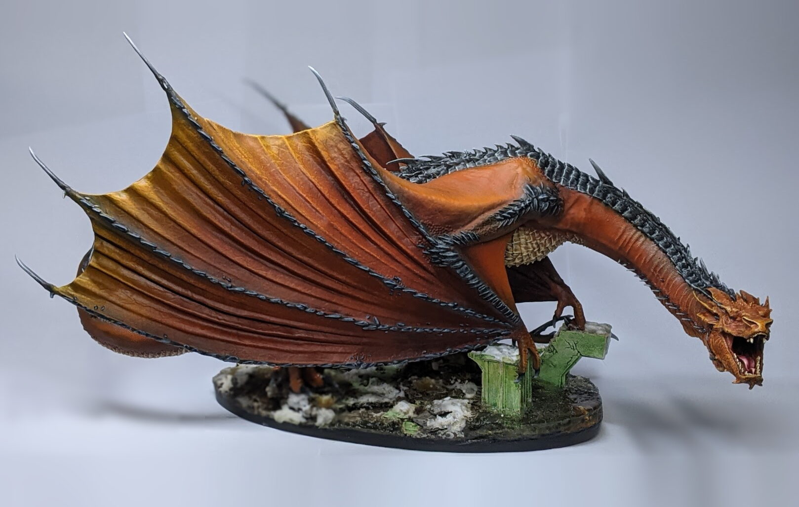
It’s funny how sometimes a colour scheme can just sort of emerge during the process of painting. I started out painting this miniature in by the book (as I saw it) colours – black spines, red ‘skin’ and wings, ivory scales. The more time I spent on it, however, the more it started to morph into its own thing – eventually, reaching this end result of brownish orange.
Things started nice and simple; I applied an all over coat of black primer with a rattle can, then I set about laying down some of the base coats with my airbrush. I built up the red over a few layers – starting with VG Dark Fleshtone as a step up from the black, moving to VG Scarlet Red and VM Ferarri Red for subsequent layers, leaving just a little of the previous colour in the recesses for each layer for shading.
With the base colours down, I hit the spines along the back with VG Charcoal Grey and the chest scales with Model Air Antique White to save me a little bit of brush time before coming back in with some VG Fiery Orange and VG Sun Yellow as broad highlights over exposed/raised/jutting areas of the dragon scales.
It’s around about this point that I’m starting to realise my Smaug is starting to veer off from the traditional red tone, but… I kinda dig it. My attempts to use Firey Orange and Sun Yellow as highlights ended up a little heavy handed, with the original Scarlet Red and Ferarri Red layers now reading more like shadows in the orange. It’s not quite bright orange like the novel artwork either – the impact of that initial base layer of Dark Fleshtone still comes through all the way to the top layer, giving everything a slightly earthier tone – almost more honey than fire. It’s not at all what I set out to accomplish, but I can’t help but think it’s like an amalgam of all of my previous considerations – the red from the movies, the orange from the novel, and just a touch of the warm, grimy look I’d previously considered at first.
I figure, why not go with it? Let’s see where this leads.
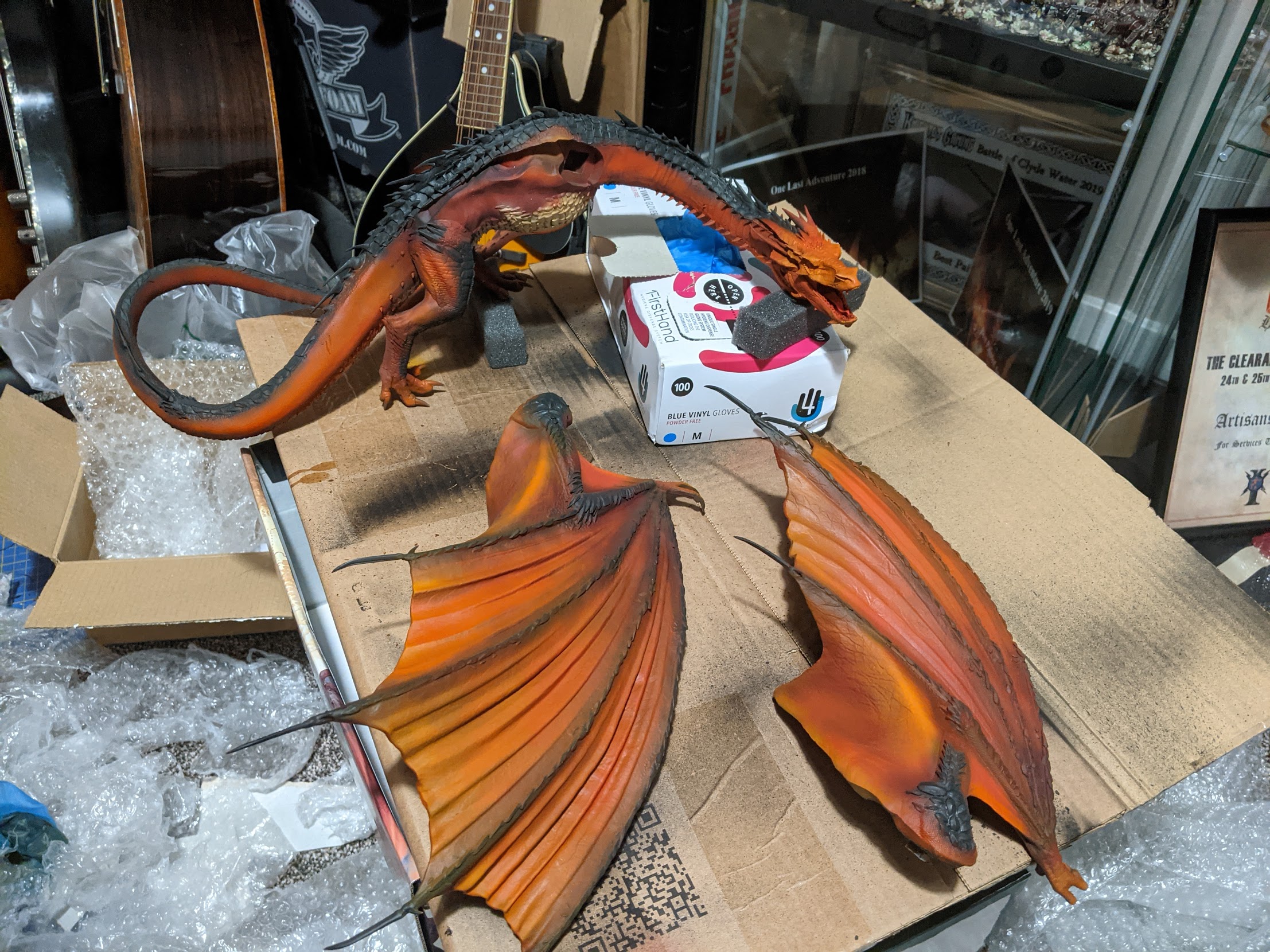
With the initial airbrushing down, I decide the next steps should be whatever is needed to get the subassemblies together as soon as possible, for a number of reasons. For one, it would be nice to still be able to rely on the airbrush to help paint over any putty used to fill any gaps on the wings without worrying too much about overspray. Nicer still, if I could finish up painting the hard to reach places – the hind legs, the inside of the wings, the scales on the underbelly – then I could get the model glued to the base and I’d have something to hold onto other than painted resin. By this point, I was already getting pretty stressed about paint rubbing off otherwise finished sections while trying to get at others.
All of that in mind, my first priority was the inside of the wings. This wasn’t too time consuming at first; I knew that I wanted the inside of the wings to look a little darker and muted than the outside, so I focussed my energies on shading rather than highlighting. I took some Reikland Fleshshade and tried to glaze it into the recesses of the wing membranes to give the wing a little bit more texture and definition. This worked really well on the inside of the wing, so I attempted to do this on the outside facing membranes as well.
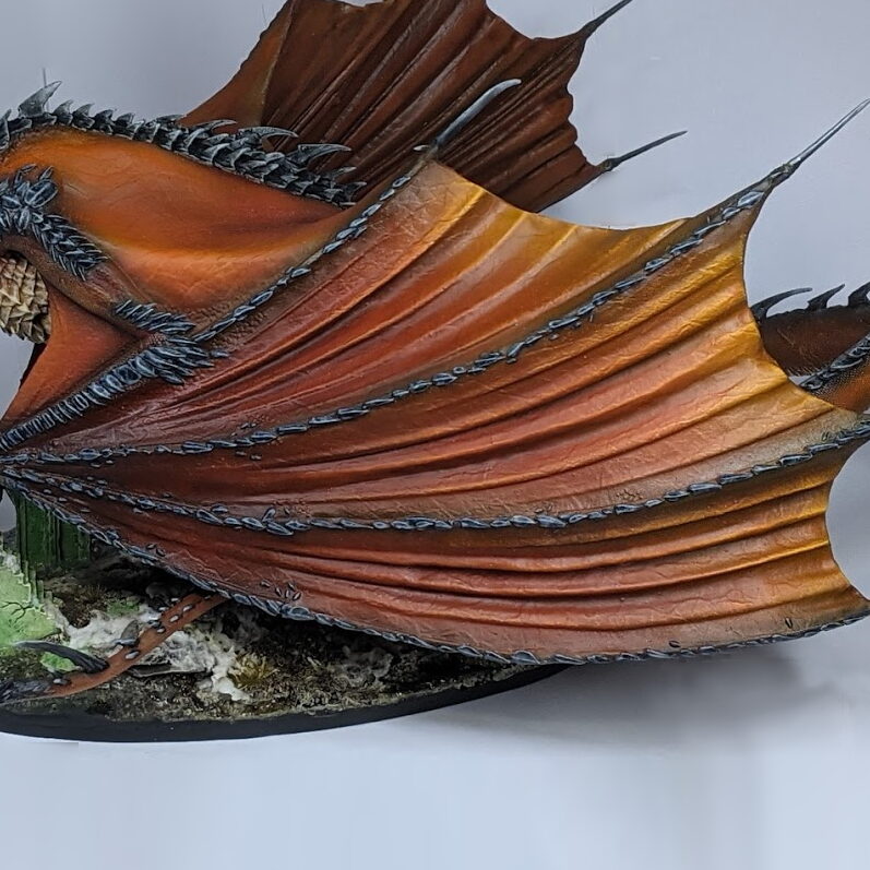
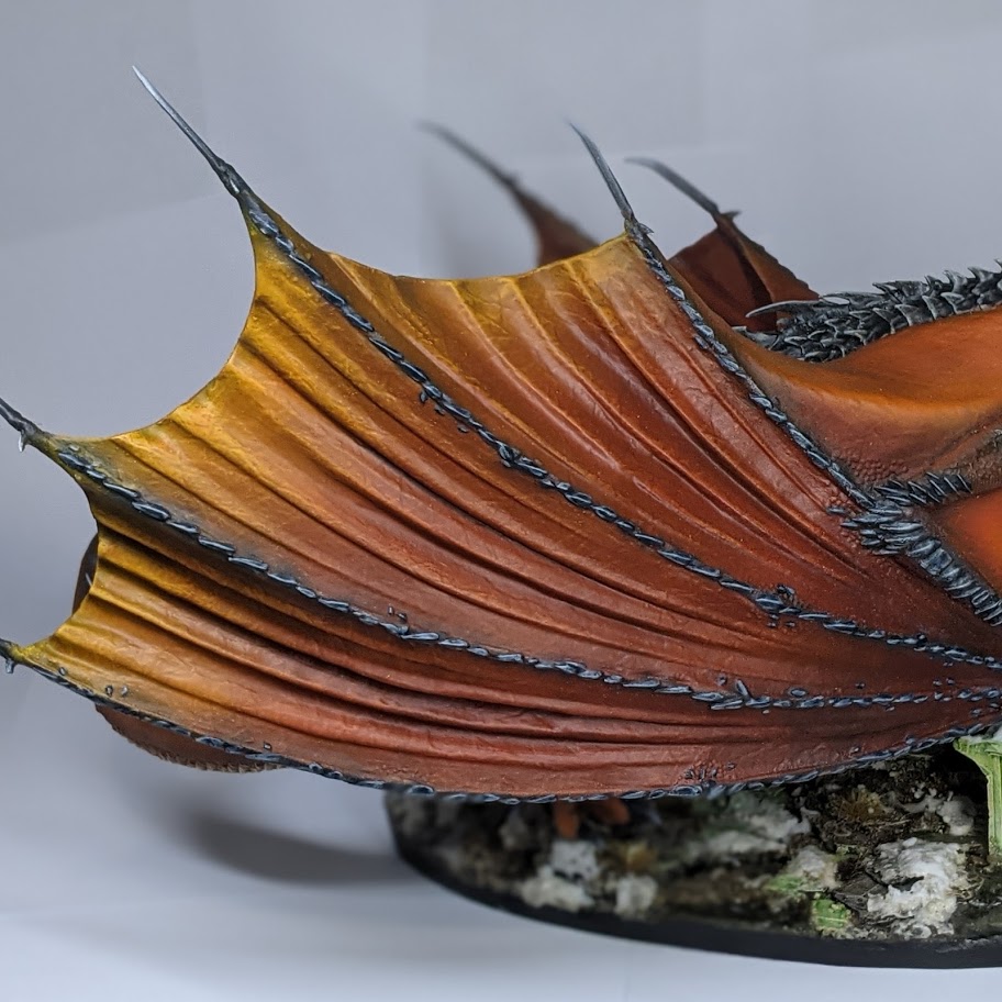
This was a little more difficult. The folds on the outside were larger and more convex, and required thinner, more deliberate glazing to avoid tide marks. A wash is still a wash though, and one unintended side effect was that the Fleshshade accentuated the surface detail of the wing membranes, making the shadows of the wings seem notably more textured and detailed than the more exposed areas. That looked too weird, so I attempted to compensate by carefully drybrushing over the convex areas on the wing with Fiery Orange and pick out some of that surface detail. To reduce the chalky look of the drybrush and tie it all together, I pulled out the airbrush again and fired some wash through it to achieve a smooth and controlled glaze over the entire wing. Towards the top of the wing, I used Cassandora Yellow, transitioning to Fuegan Orange in the recesses and over the convex areas a little further into the wing. For the final third of the membrane closest to the arm, I used Reikland Fleshshade for that warm, reddish brown. Once this pass had dried, I used Reikland Fleshshade once again to very gently tint the recesses of the wing all the way from just about the top to the very bottom. This process really helped smoothen and bring together the various competing variations in tone – from the highlights and shading in between the folds to the overall gradient spanning the length of the wings – but it also massively desaturated the colour palette of the miniature. The bright orange highlights from the airbrushed base coat were almost gone completely, replaced with a warm and leathery ochre tone.
Now that the majority of the wings (and all of the wing lining) was finished, I set my sights on the scaled underbelly. Not much to say here really – I’d hoped to do a bit more of a fade with the airbrush using that nice greyish beige tone from Model Air Aged White, but just about all of that was lost in the wash/drybrush stage. I started out with the best of intentions – pin washing the scales with Seraphim Sepia as best I could, then attempting to highlight them with VG Off-White. Maybe I was rushing my way through it or maybe I’m just not very good at edge highlighting, but nothing I did here really felt like it was working. My lines were thick and sloppy and just didn’t suit the model at all. A few sloppy rows of scales in, I gave up and drybrushed the damn thing, followed up with a Seraphim Sepia wash, thinned down with a little Lahmian Medium. Not going to win any awards for my innovative technique here, but it more or less worked. Looking back, the chest could benefit from a little more definition, although for whatever reason I really like how it turned out on the underside of the tail.
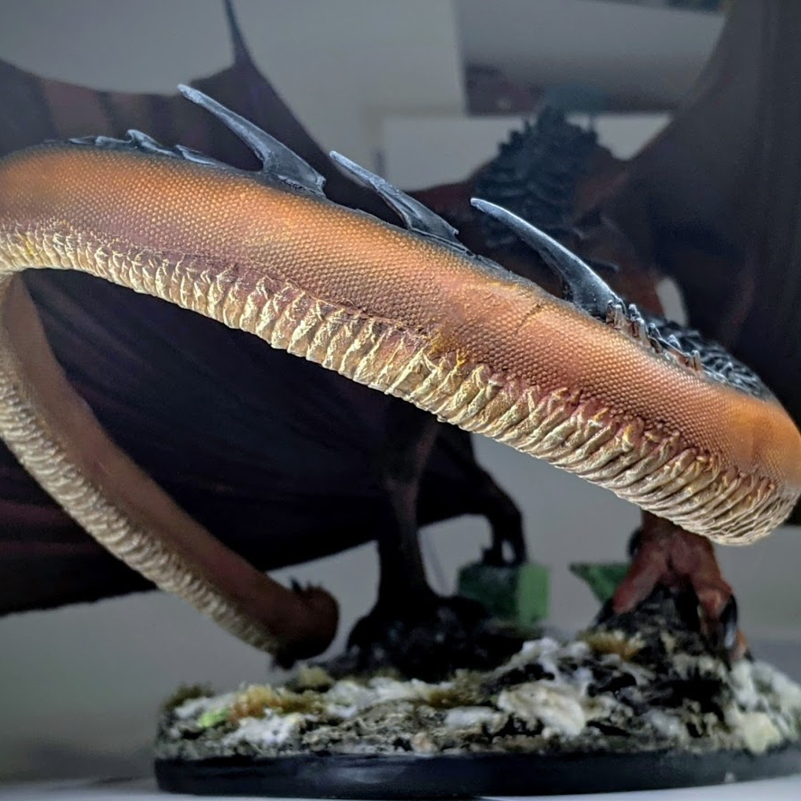
Now the only thing left to do before putting my subassemblies together was the legs. This comprised of two main areas – the orange ‘skin’ scales and the bigger, black scales on the thigh – thankfully, neither were especially difficult to do. For the black scales, I took my base charcoal colour and successively added a little Heavy Bluegrey, picking out sharper and finer highlights to the edges and raised areas, then cleaning up with recess wash of Nuln Oil. The ‘skin’ (for lack of a better term) was equally simple, although a little more time consuming. I took a large, round tipped drybrush and – as lightly and consistently as I could manage – brushed Vallejo Model Colour Light Orange over the surface of the scales. This includes the body, legs, neck and shoulders – no sense in risking inconsistency later. Once this was dry, I applied a very light wash of Cassandora Yellow over all of the areas I’d just drybrushed – thin enough that the wash did little to effect the overall colour of the miniature (although it did mildly restore some saturation to the colour), but just enough to clean up anywhere that the drybrush caught more than just the surface/edges of the scales.
Looking back, I think I missed a trick in the airbrushing stage. I forgot that this drybrush/wash stage would blend together the airbrushed volumes somewhat, and so the final outcome looks a little more flat than I had intended. It’s not that all of the subtlety in my airbrushing was lost – the inside of the tail is a little darker and redder than the outside, for example, and if you look carefully there is still a noticeable fade to scarlet red as you reach the recesses and scales on the underbelly – but the effect is definitely a lot less noticeable than I had hoped for. Learn from my mistakes, folks – less isn’t always more when it comes to contrast in your base coats, especially when you know you’re going to be painting over it later.
The last step before finally reassembling the subassemblies was a quick coat of varnish. This would help lend the miniature a little protection against my sweaty Dorito fingers during the last leg of painting – and also saves me having to varnish the whole miniature from top to bottom after putting it on the base (potentially ruining the glossiness of the snow effect or the clarity of the resin water).
Affixing the wings was surprisingly painless, thanks to some dry fitting and hot water shaping back in the assembly stage. Still, there were a couple noticeable gaps left, which I did my best to fill cleanly and minimally with a little bit of green stuff. Once this had cured, I pulled out my airbrush again, primed it with a little white primer and carefully applied a few layers of brown, red and orange again to blend it back in naturally.
Affixing the now complete Smaug miniature to his base, on the other hand, was a little tricky. Despite my best efforts to approximate and dry fit Smaug onto the base, it still wasn’t perfect. It’s surprisingly difficult to get an accurate idea of where the feet were going to line up while holding two heavy loose wings in place. I experimented with a number of angles and some gentle bending of the wrist before I found a suitable place for the miniature to sit. Once I was happy with the angle, I super glued his feet in place then filled in the gaps around his toes with additional debris and texture paint. I did my best to paint the additional support stones and debris to match the base and once the tufts, leaf litter and snow effects were down again, it all looked fairly seamless.
Okay, so far so good. We’ve got Smaug on his finished base. We’ve still to do the black spines down his neck, back, wings and tail; his talons and claws need painted and his face needs some special attention. Home stretch, here we go- oh wait never mind let’s absolutely ruin the miniature instead.
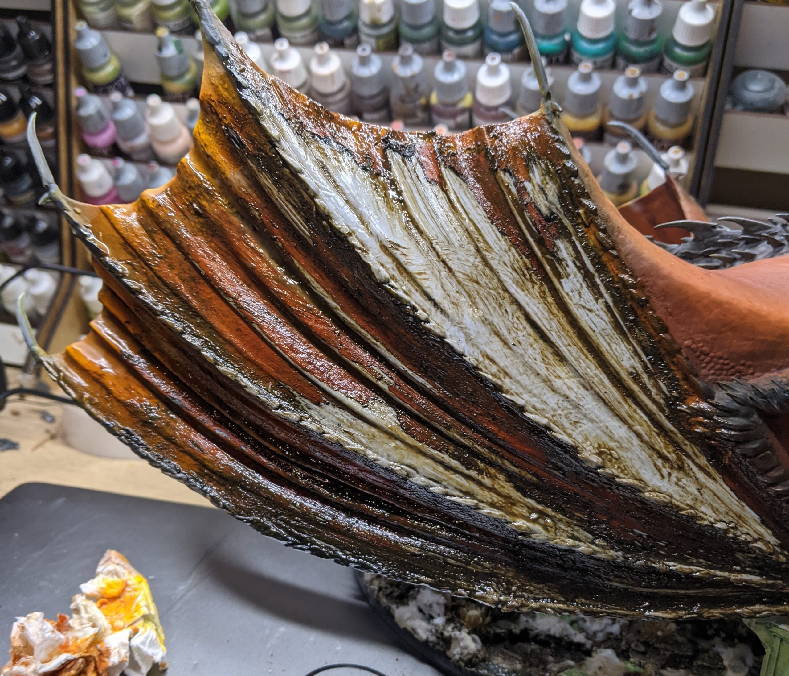
See that close up picture of one of the wings a little further up? That’s what I like to call the good wing. I didn’t consciously do anything different while attempting to paint either of the wings earlier, but so much of the experience was a back and forth between different colours and techniques. By the time the first wing was finished, I only had a rough estimate of what colours I used in what order and what I did that was significant to the final outcome. Suffice to say, one wing ended up looking substantially better than the other. The wing you see pictured earlier has – in my opinion – a very natural, leathery and opaque quality to it that I really liked. By contrast, the problem wing (as I like to refer to it) ended up with more of a glassy, candied look about it. On its own, this could have looked alright, but it wasn’t even the entire wing that was the problem – just the upper membrane. This was made worse by the fact that the problem wing was the front facing wing – the one I’d actually have to look at in my glass display cabinet for the rest of time. It grated on me and tugged at my mind until I just couldn’t restrain myself. I tweaked it, I experimented with it. I tried matt varnish, I tried painting over it. I lost days of my life to this madness but nothing I did made it look remotely as good as the first wing. Eventually, my tinkering took its toll and the paint on this wing membrane started to look like a Google Image search for ‘warhammer thin your paints‘.
There was nothing else for it – out came the Biostrip 20, as I carefully attempted to remove the paint from the offensive membrane. Naturally, this dripped on the other two and before I knew it, the whole wing had to be repainted from scratch. Hence, the utter disaster you see above.
On the upside, after a couple of deeply stressful evenings, the problem wing began to look a damn sight better – and I celebrated by finally moving onto the spines and talons.
As with the scales on his underbelly, once again, I found myself falling into the cycle of attempting to highlight them individually, things looking kinda rubbish, and attempting to resolve this with a drybrush and a wash. Only this time, the drybrush/wash approach kinda looked a little rubbish too. When that failed, I decided to give highlighting another go. I washed the scales a couple of times with Nuln Oil to darken down the grey tone and set about attempting to highlight them by hand again. My thinking here was similar to painting the armour on my Gundabad Trolls – lot’s of little tiny strokes perpendicular to the edge to create a rough, textured looking highlight. To my amazement, it actually started to look pretty good. The previous attempt at drybrushing left a little texture to work over, and the transition between dark charcoal to the grey edge highlight was smoother thanks to the wash creating a natural gradient over the drybrushing. I finished up the rear spines with one last pin wash of Nuln Oil mixed with a little Black ink in the recesses to push the contrast a little harder.
I had a very similar experience painting the black ridges on his wings as I did on the back. I wanted to avoid drybrushing initially – lest I accidentally get any on the wings – but my early attempts to highlight those wing scales went very poorly indeed. After a failed attempt at highlighting by hand, I very carefully washed them with a 50:50 mix of Nuln Oil and Drakenhof Nightshade before extremely carefully drybrushing with Heavy Bluegrey and Wolf Grey.
There were a few black spines that I didn’t drybrush however – namely the spines around Smaug’s head, on his tail, and at the end of the wings. These were a little too big to look good with just the edges picked out, so I did a classic airbrush move and blasted on a simple little airbrush fade by starting them black and putting down a couple of thin layers, adding a little more Heavy Bluegrey and then Elfic Flesh as we move closer toward the tip. Nice and simple. There were a few middling sized spines on the tail that I couldn’t do this with for risk of overspray, so I painted those with a couple quick glazes applied with a regular hairy brush instead – and the same for his claws and talons.
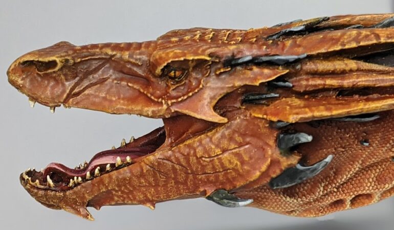
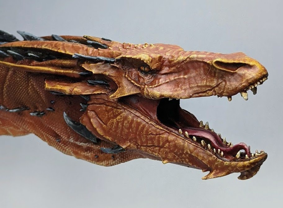
Last but not least came the face – the focal point of the miniature and arguably the most important. The majority of this was painted like the rest of the miniature – black/grey glazed spikes and VM Light Orange drybrushing on the scales. The only real difference was the amount of time I spent going back and forth between drybrushing, washing and glazing in colours to get a reasonably smooth finish with enough contrast. Towards the lips and around the eyes I added a little VM Light Yellow into my Light Orange to help push the contrast on these key areas. Once the drybrushing was finished, I applied a Cassandora Yellow wash all over the face to bring everything together a little, then Fuegan Orange and even a little Reikland Fleshshade applied in a few of the deepest recesses like under the eyes. I also put a very thin coat of Bloodletter Red glaze on the little stretchy fleshy bits in the corner on his mouth just to differentiate them a little from his leathery orange hide.
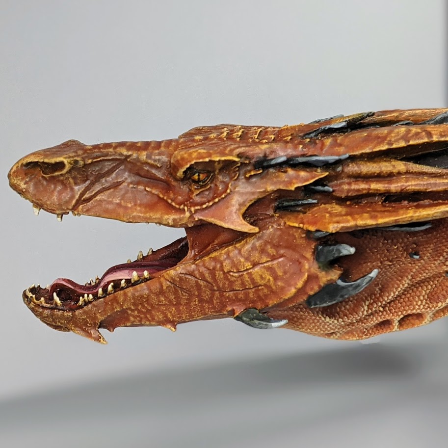
The details of the face were probably the most enjoyable part on the entire miniature to paint. Back when I was airbrushing the model, I sprayed a little Ferarri Red into the mouth to colour the insides, so all that was left to do these was splash some Reikland Fleshshade inside the mouth, which did a good enough job of picking out the little mouth details given how little light made it’s way in there anyway. For the tongue, I mixed a 50:50 VG Squid Pink and VG Rosy Flesh and used this for a basecaot, followed by 3 successive layers of highlights adding a little more Elfic Flesh in each time. Afterwards, I put a little Reikland Fleshshade down in the centre of the tongue – enough to blend my layers together without dulling the brightness of my brightest highlights. The teeth were a quick case of Elfic Flesh, washed with Seraphim Sepia and topped with a little Elfic Flesh. Finally, the eyes were basecoated with White, then I applied couple coats of Cassandora Yellow wash, finished with a tiny little bit of Bloodletter Red glaze in the corners to achieve a fiery red glow. I picked out the outline of the eyes with black ink to ensure they still popped against the orange skin before very carefully painting a thin slit for the pupil, tapered somewhat at the top and bottom. For a final touch, I finished them with a little gloss varnish.
God help me, I was finally ready to call Smaug finished. I applied a matt/satin varnish to the areas that had been painted since the subassemblies came together and tidied up whatever mess I’d made on the base from the painting process. I grabbed a bunch of sheets of A4 and took some photos of my finished work and threw it up on social media.
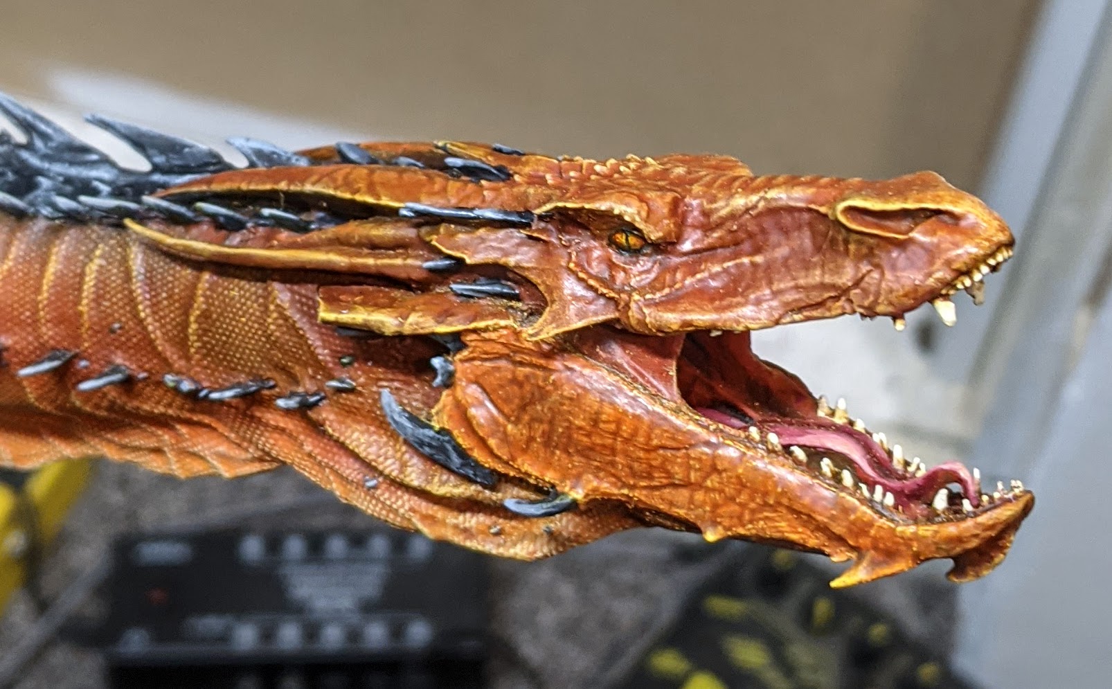
If your gut is telling you that there’s a little more to this story… Well, your gut is right. A couple of days pass, and while editing the photos for this blog (mostly white balance, but I also try and clean up the backdrop2 a bit too), I start to notice some problems with the finished miniature here and there. This sort of thing happens from time to time – little mistakes or omissions can become painfully obvious when you’re looking at a well lit, often magnified, still photo of a miniature. If you’re lucky (or just paying close enough attention), you’ll notice these immediately and go back and fix them before you proceed. Other times, you’ll conclude that it’s not enough of an issue to warrant spending any more time on a ‘finished’ miniature. Then there’s the times when you notice something glaring and ugly and it gnaws at your soul. This was one of those occasions – the glaring issue in question being a hideous little mould slip running down the right side of Smaug’s bottom jaw.
It’s subtle. If you don’t look too hard, you might not notice it – your brain might even parse it as a detail of the mouth and move on. I completely failed to notice it until after the airbrushing step, but at the time dismissed it as not really noticeable enough to justify the hassle of correcting it. And this was fine, until I took a photograph of it and uploaded it to Twitter. Now every time I check in on the post to see how it’s doing or respond to a comment, I see it. Staring me in the face. Taunting me. What’s worse is that – as with the problem wing before it, this was on the most visible side of the face in my display cabinet. Soon, this little mould slip was all I could look at.
Once again, I was powerless to stop myself. I took an X-Acto Knife and I sliced off the slip. And so it was that I came to relive the hell of The Problem Wing all over again. For three days, it consumed me. At first there was just that little edge of the jaw to paint. I primed it with a brush and did my best to blend it in with the jaw, but no matter what I did I just couldn’t quite match the colour of the rest of the face.
The thing you have to remember here is that the colour of this Smaug is no longer any identifiable colour from a single paint, but a horrific amalgam of several paints and washes layered translucently with both an airbrush and a hairy brush. Nothing I tried could quite match it. Eventually, as with The Problem Wing before it, the paint became so thick that I had to carefully strip it off entire right side of the jaw and attempt to paint again from scratch. Fortunately – thanks to the accumulated wisdom from 10’s of prior failed attempts – things went a little better this time. Eventually, I managed to match the jaw close enough that another wash or two and a little drybrushing on the rest of the face brought it all back together again.
Deep breaths, it’s all finally over. Smaug the Terrible, Desolator of the North is finally 100% finished.
So, what are my closing thoughts? Well, first and most importantly – I’m glad he’s done, and I like how he looks. It took a lot of trial and error, but after all the heartbreak and stress, I’m really happy with what I ended up achieving on this miniature. With that said, this was a stressful painting experience from start to finish.
I don’t know why I was so surprised by this revelation. You don’t go into painting a model like this without putting some amount of pressure on yourself – no-one wants to ruin a £340 miniature, after all. It makes every time you snap one of those fragile little spines on the back of the wings off several orders of magnitude more disheartening – and I snapped those pointy little jerks off a lot in the process of painting this miniature. Of course, some of the stress I experienced was entirely my own making – that’s sort of what you get when you jump into a big, expensive and airbrush heavy project with only a little bit of airbrushing experience under your belt.
Ah well. If nothing else, Smaug was a wonderful and woeful high stakes trial by fire for the airbrush; a trial I’m happy to say I made it through, if only by the skin of my teeth.
Hmm. You know, painting that last Exorcist for my Adepta Sororitas army seems almost trivial now.
Until next time, thanks for reading and happy wargaming!
1 Except maybe making a blue stuff press mould from the scales’ surface texture on another part of the tail and using it as a stamp over a very fine strip of green stuff over the joint. A great idea, about a month too late.
2 You ever notice how sometimes there’s some weird lighting going on in the background of my photos? Most often, that’s because I have edited out the overlap of a couple of bits of A4 paper that I used as a backdrop for my photo (and I’m not very good at image editing).